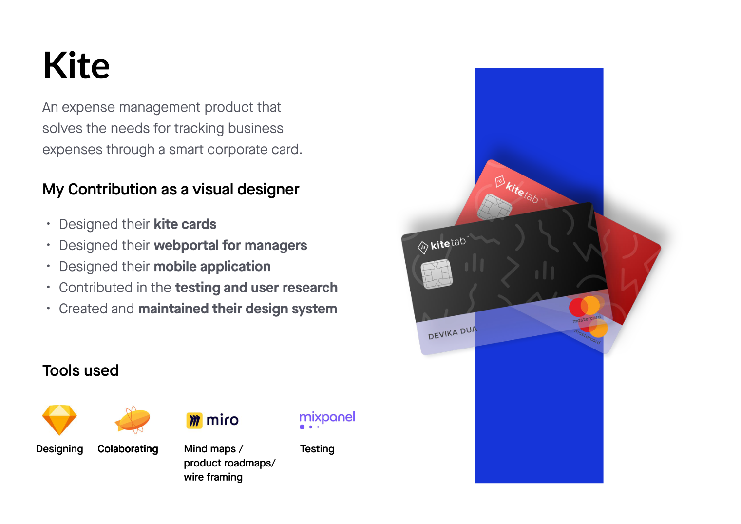
Kite — an expense-management product that tracks business spend through a smart corporate card, replacing lost-and-faded receipts with real-time clarity.
Kite is an expense-management product that solves the need for tracking business expenses through a smart corporate card. I designed the Kite cards, the web portal for managers and the mobile application — and created and maintained the product's own design system along the way.
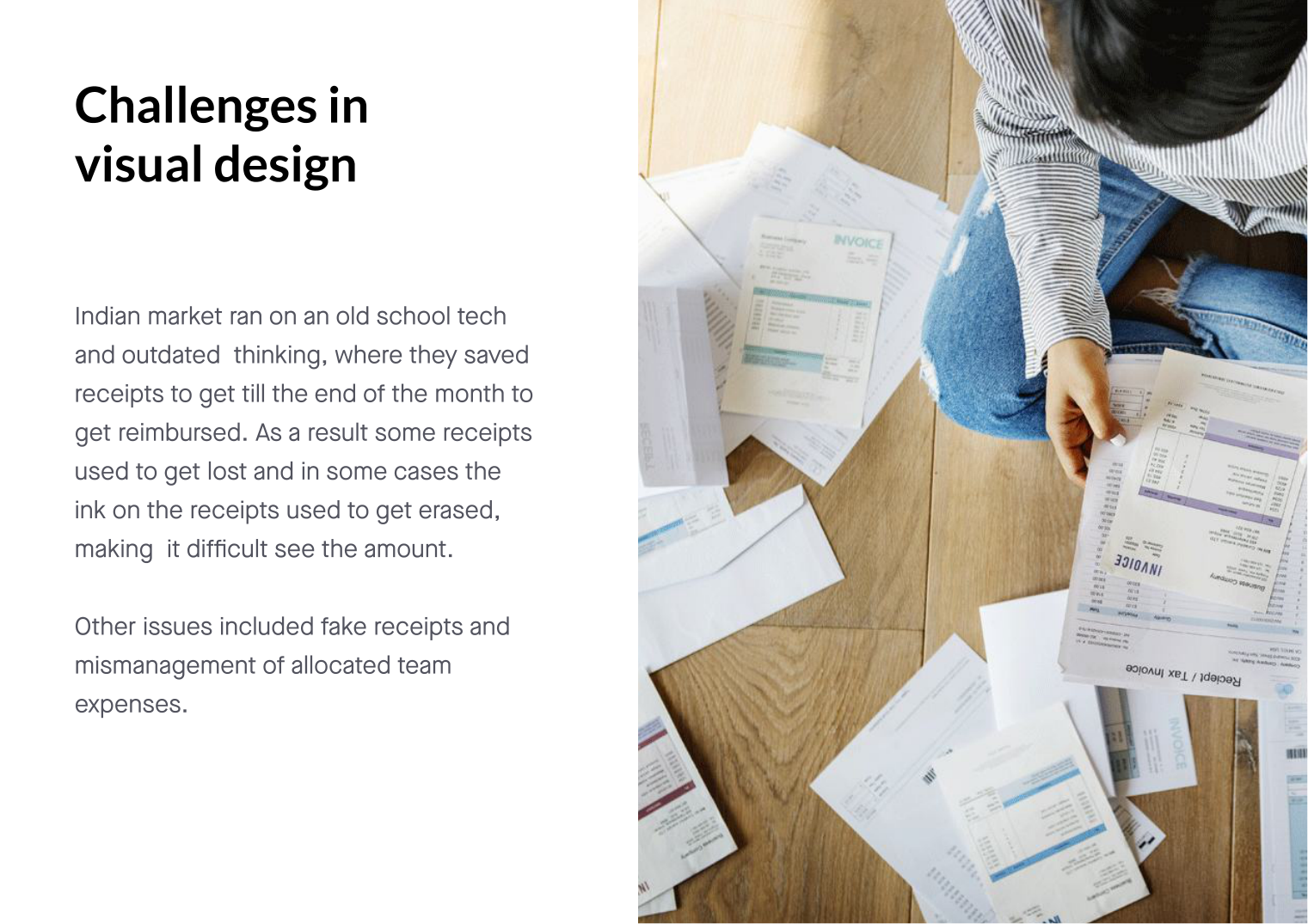
The Indian market ran on old-school tech and outdated thinking, where employees saved receipts till the end of the month to get reimbursed. That created a chain of failures:
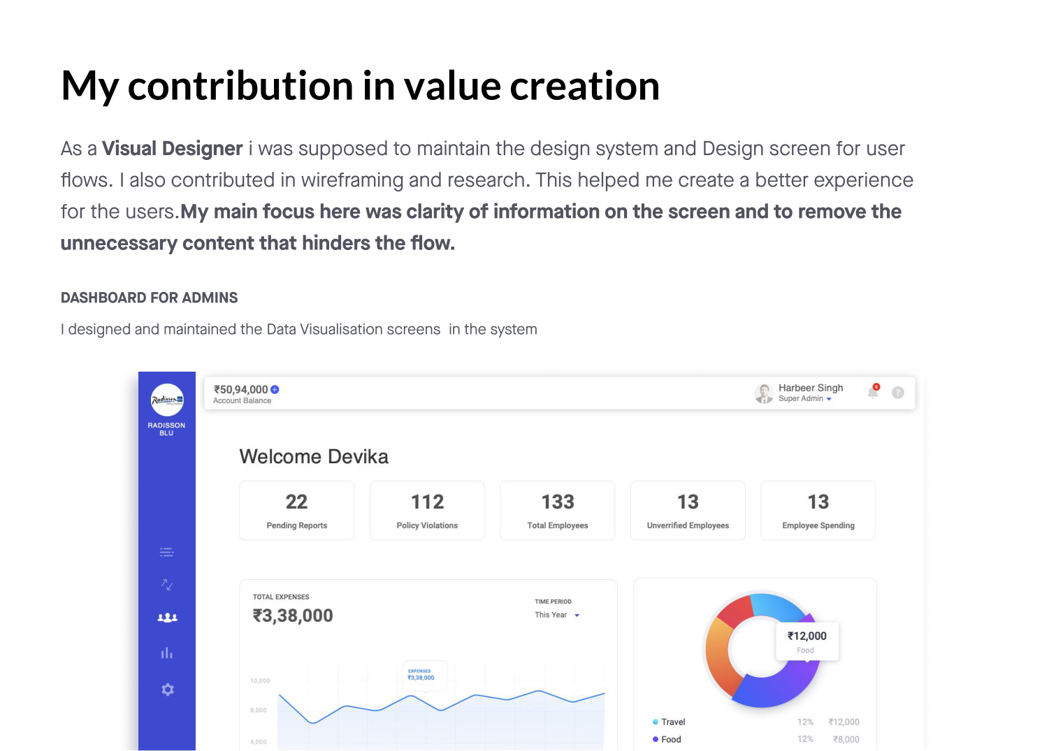
I led wireframing and research to understand the real friction in expense flows — for both the employee spending and the admin approving. The insight that shaped everything: the screen had to carry clarity of information, and shed the unnecessary content that hinders the flow.
As the visual designer I maintained the design system and the screens for every user flow. My focus was to create a better experience by surfacing the right information and removing everything that didn't serve the task.
I designed and maintained the data-visualisation screens — giving admins a live read on reports, policy violations, employees and spend, instead of a shoebox of receipts.
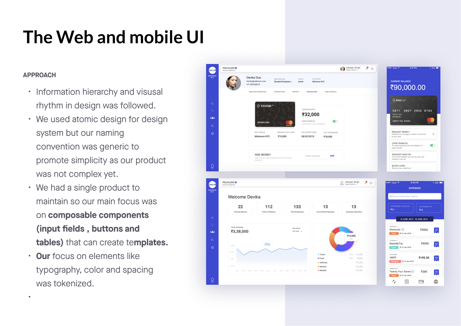
Across web and mobile I followed strict information hierarchy and visual rhythm. I used atomic design as the backbone, but kept naming generic so it wasn't too complex. Since Kite was a single product to maintain, I leaned on composable components — input fields, buttons and tables — that compose into templates, with typography, colour and spacing all tokenised.
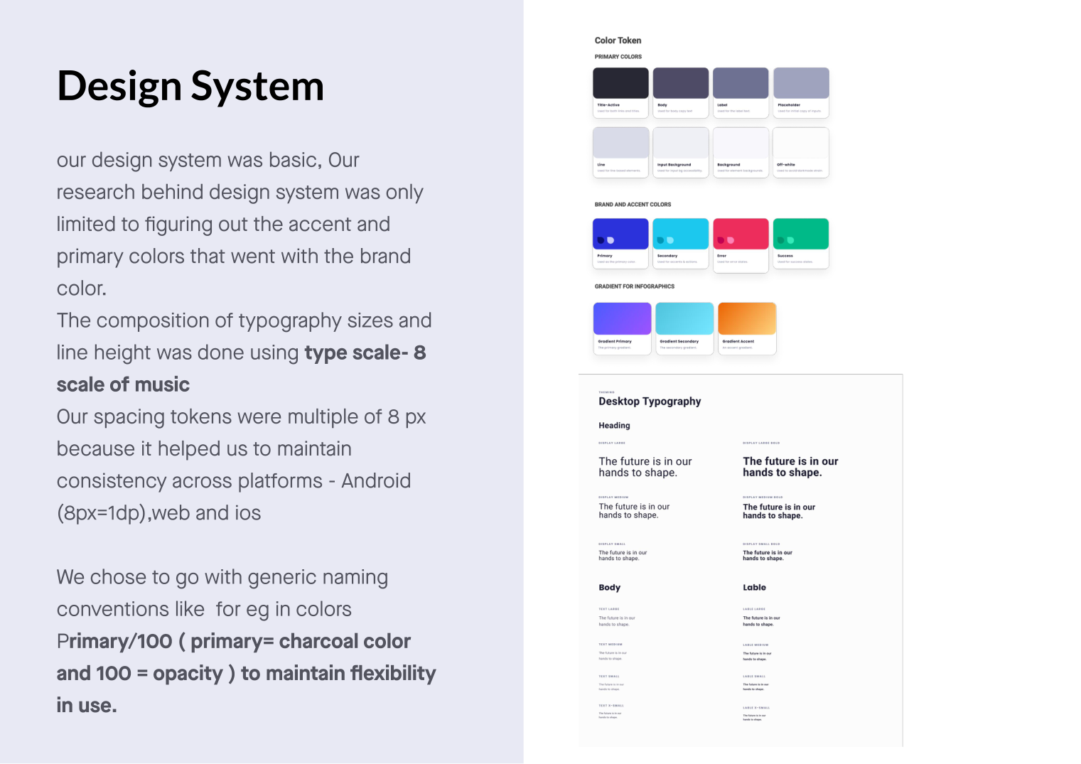
I created and maintained Kite's design system. The research behind it was deliberately focused — figuring out the accent and primary colours that went with the brand. Typography sizes and line heights used a type scale of 8 (the scale of music), and spacing tokens were multiples of 8px to stay consistent across Android, web and iOS.
I chose generic naming conventions — e.g. primary/100 (primary = charcoal,
100 = opacity) — to keep flexibility in use as the product grew.
The finished product replaced the paper trail entirely: spend happens on the smart card, the mobile app captures it in the moment, and the web portal gives managers a clean, trustworthy view of every transaction — all built on one tokenised system across platforms.
Clarity on the screen, nothing in the way.— The design principle behind Kite
Kite turned a lossy, end-of-month receipt ritual into real-time expense tracking — designed end to end across card, mobile and web, on a design system I built and owned. Clearer screens, fewer fake claims, and spend that managers could actually see.