← All work
Gojek · DLS Design Systems Tokens · Theming 30+ products

One system, infinite themes

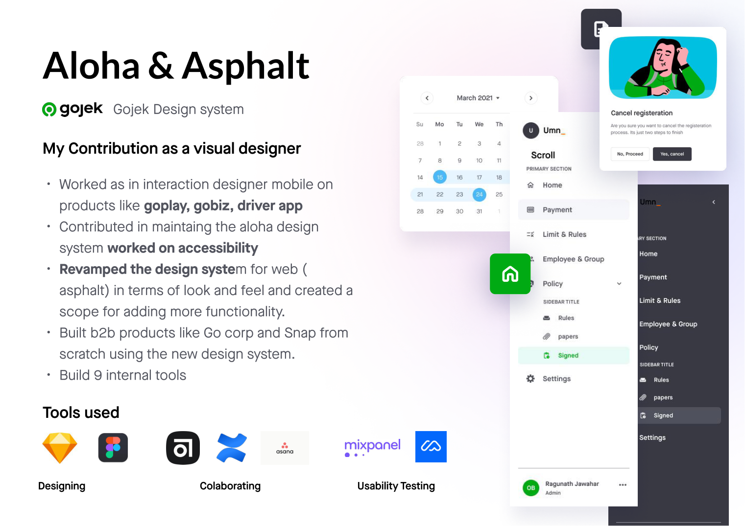
Aloha & Asphalt — rebuilding Gojek's design system from the look-and-feel up into a token-driven, themeable, semantic foundation that 30+ products could trust.

Role
Visual designer — DLS revamp, color tokens, theming, accessibility
Partners
DLS team, product designers, engineers, researchers
Scale
30+ products · web + Android + iOS
Focus
Token system, theming & adoption
Aloha & Asphalt — Gojek design system contribution
01 / Discovery

Finding the problem

Gojek's design system, Asphalt, powered everything from GoFood to the driver app and a fleet of internal B2B tools. But it had grown organically — the system was basic, carrying little beyond an accent and a primary colour tied hard to the brand.

As a visual designer on the DLS team, I was handed the responsibility of revamping the system for web and beyond — taking Asphalt in terms of look and feel, and creating a scope for adding far more functionality. Built B2B products like Go Corp and Snap from scratch on the new system, and shipped 9 internal tools on top of it.

02 / Problem

Challenges & priorities

When I took on the DLS, the existing system was holding teams back in concrete ways:

  • Look and feel was old — and it showed across every product built on it.
  • Lack of functionality — too few variants; teams forked custom components.
  • No storybook for the devs — no single source of truth in code.
  • Not themeable — no light/dark, no per-product theming.
  • 30+ products all leaning on it, so the cost of using Asphalt in a product was almost the same as building custom — and components were hard-coded.
Challenges with the old DLS — look and feel, no storybook, not themeable
Mapping the challenges against the old "Oms" DLS before the revamp.
03 / Research

Research

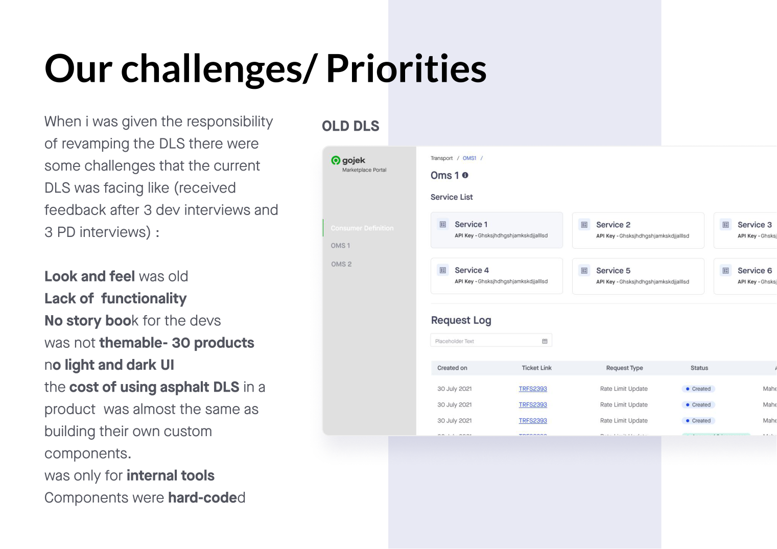
I ran a quick, focused study on the missing functionality and prioritised it by need and satisfaction. I gathered feedback through 3 developer interviews and 3 product designer interviews — the two audiences that lived inside the system every day.

  • Designers wanted a richer set of variants and a system that felt current.
  • Engineers wanted components that were composable in code, versioned and documented.
  • Both wanted colour and type that could flex to a product's context without a rebuild.
04 / Method

Method — a token system

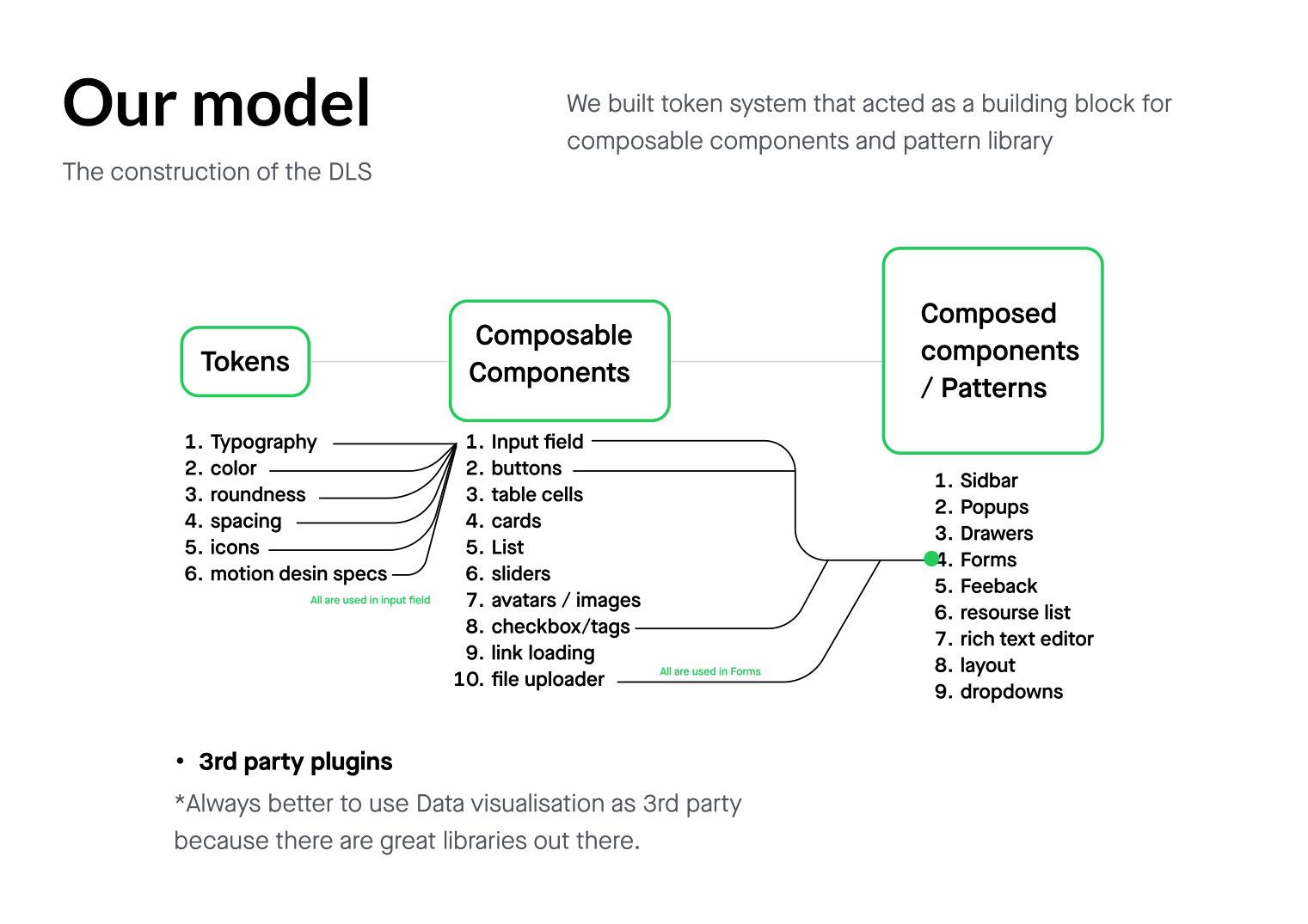
The strategy was to build a token system that acted as the building block for a composable component and pattern library — so the system scaled from atoms to full screens without anyone re-inventing the wheel.

Tokens → Components → Patterns

  • Tokens — typography, colour, roundness, spacing, icons and motion-design specs.
  • Composable components — input fields, buttons, table cells, cards, lists, sliders, avatars, checkboxes, link-loading, file uploaders.
  • Composed patterns — sidebars, popups, drawers, forms, feedback, resource lists, rich-text editors, layouts, dropdowns.
  • Type sizing on a type scale of 8; spacing tokens as multiples of 8px (8px = 1dp) consistent across Android, web and iOS.
Construction of the DLS — tokens, composable components, composed patterns
The construction model: tokens feed composable components, which compose into patterns.
05 / Communication

The operating model

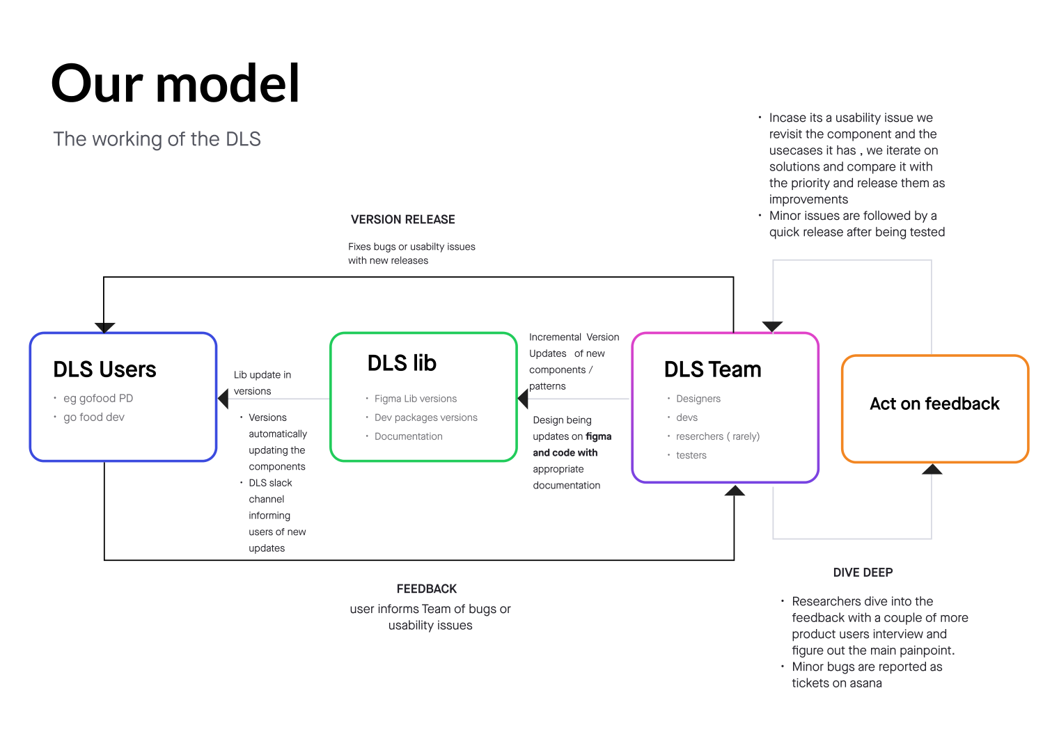
A design system only works if its update loop is legible. I defined how the DLS operated as a product — who consumes it, who maintains it, and how feedback turns into releases.

  • DLS users (product designers & devs) consume versioned Figma libs and dev packages; a DLS Slack channel announces new updates.
  • DLS team (designers, devs, testers) ships incremental version updates of components and patterns, in Figma and code, with documentation.
  • Feedback → act → dive deep — users report bugs and usability issues; minor bugs are tested and released fast, while real usability issues get a deeper dive with more user interviews before iterating.
The DLS operating model — users, lib, team and feedback loop
The working model of the DLS — a feedback loop between users, the lib and the team.
06 / Iteration

Diving deep — colour tokens

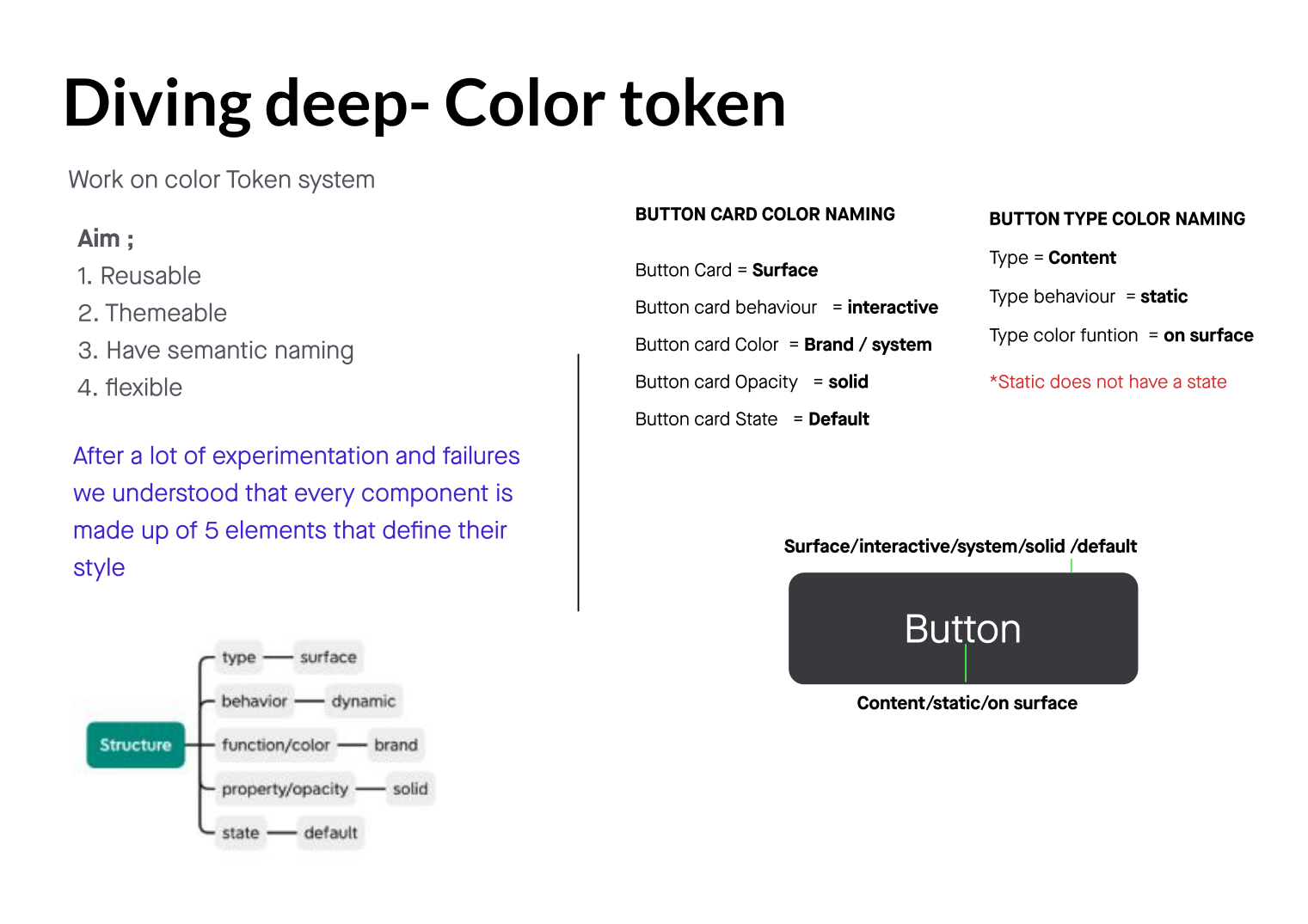
The colour system was the hardest and most valuable part. My aim was tokens that were reusable, themeable, semantic and flexible.

Five elements that define a component

After a lot of experimentation and failures, we understood that every component's style is made of five elements: type (surface), behaviour (dynamic), function / colour (brand), property / opacity (solid) and state (default).

That gave us semantic naming we could read at a glance — a button card became Surface / interactive / system / solid / default and its label Content / static / on-surface. Names that describe role, not raw hex.

Colour token anatomy — five elements and semantic naming
Every component decomposed into five elements with semantic, theme-ready names.
07 / Final

Final — theming at scale

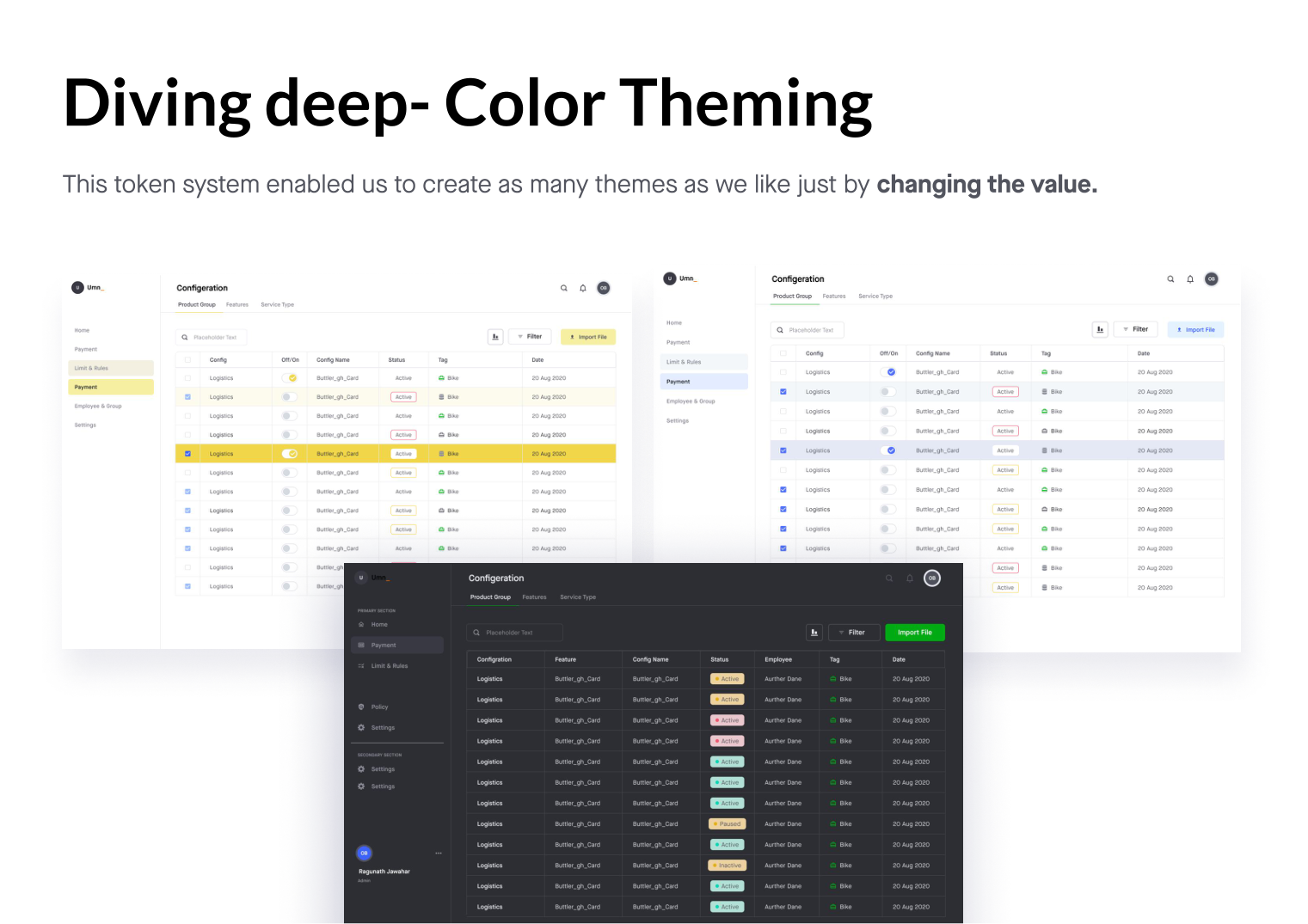
Because style was encoded as semantic tokens, the system could spin up as many themes as we liked just by changing the value behind each token — including a real light and dark mode the old system never had. We also chose generic naming conventions like primary/100 (primary = charcoal colour, 100 = opacity) to keep flexibility in use.

Colour theming — light and dark themes from one token set
One token set, many themes — light and dark generated by swapping values.
Name the role, not the hex.
— The principle behind the token system
08 / Impact

Impact

A complete revamp of the design system — from look and feel to a token-driven, themeable foundation. I enhanced colour and typography, improved accessibility with detailed docs, and built components in collaboration with stakeholders. Crucially, it saved development time and cost for the devs working across products from internal to customer-facing.

30+
Products unified on one design system
5 els
Token elements define every component's style
1→∞
Token set → unlimited themes, incl. light & dark
Next case study
Kite — Smart Corporate Card →