← All work
GoTo Finance · Midtrans Senior Product Designer Merge 2 products Indonesia

One wallet, two products, zero transfers

Merging Midtrans (revenue) and IRIS (vendor payments) into a unified wallet so merchants pay vendors instantly from their revenue — a retention-first redesign that drove $600M+ GTV.

Role
Senior PD — research, IA, interaction, UI, dev handover
Team
Product, Backend, Sales & Business stakeholders
Timeline
Jul 2022 — Jan 2023 · phased
Impact
+$600M GTV · retention-first
Old vs new navigation for the merchant dashboard
01 / Discovery

Finding the problem

Merchants lived across two of our products. Midtrans managed revenue — receiving, tracking, withdrawing and exporting for reconciliation. IRIS handled vendor payments through a wallet. They never talked to each other.

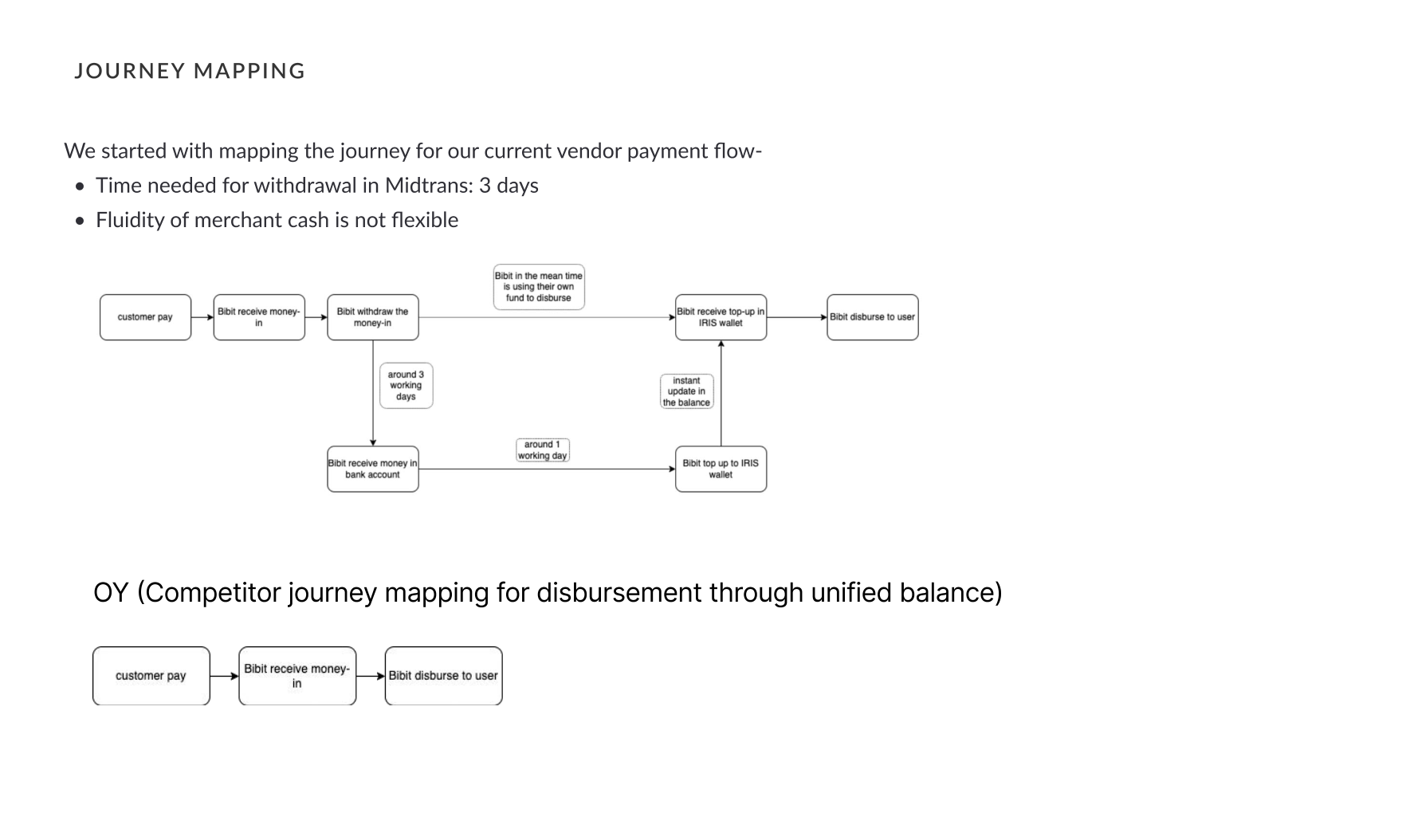
The story that crystallised it: Andre runs a store and an online shop. He collects revenue in Midtrans but pays his fabric & transport vendors from IRIS. To pay them he first has to move money out of Midtrans — a 3-day withdrawal — then top up IRIS. On payment day, the money simply wasn't there.

Midtrans legacy dashboard
The legacy Midtrans dashboard — revenue lived here, vendor payments lived elsewhere.
02 / Problem

The problem statement

The friction of moving money between "money-in" and "money-out" pushed merchants toward competitors like Xendit that offered a unified balance — a direct GTV and retention risk.

Quantified loss from focus interviews

  • Interviewed 5 major firms; several already split volume to other gateways over this friction.
  • Identified potential monthly GTV at risk — e.g. Tokocrypto ~Rp 1T, Mekari ~Rp 100bn, Nobi ~Rp 15bn.
  • Cash fluidity, not features, was the deciding factor.
Journey mapping of the vendor payment flow vs competitor
Journey-mapping our disbursement flow against a unified-balance competitor.
03 / Research

Research

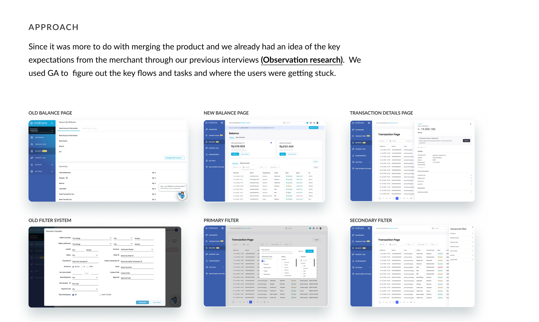
With a tight timeline, I leaned on quantitative data + targeted qual. I used Google Analytics to find the key flows and exactly where users got stuck, and validated the unified-balance need through focus interviews and competitor analysis.

  • GA funnels exposed dead-ends — e.g. verifying a new receiver forced a detour to another page.
  • Observation research told us what merchants expected from a merged product.
  • An accountant persona ("Bibit") clarified the real decision: how much is clearing in the next 10 days so I can plan vendor payments?
Old vs new balance and transaction pages
Old balance, transaction-detail and filter systems vs the redesigned pages.
04 / Method

Method — a phased release

With a retention-first model and real backend constraints (two wallets still maintained separately), I planned a deliberate three-phase release so we kept momentum even if the final phase slipped.

Phase 1 — one home, two wallets

Bring IRIS into the Midtrans dashboard with merged transaction & statement pages so merchants track income and expenses together and reconcile at once — while wallets stayed separate. Staging the complexity kept the learning curve gentle.

Phase 2 — pay vendors from revenue

Let merchants pay vendors directly from the revenue balance. Because withdrawal of the disbursement balance wasn't yet possible, I designed for that constraint honestly — making the unified-but-limited balance legible.

Concept wireframes for unified balance, variant explorations
Concept wireframes — exploring where actions and balance breakups should live.
05 / Communication

Communication & IA

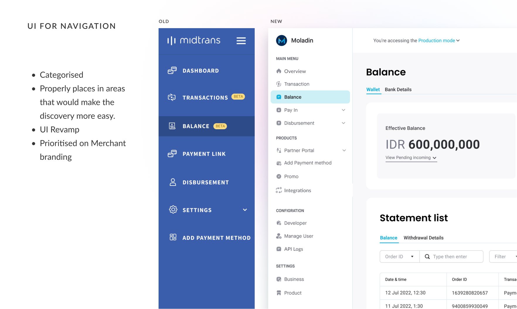
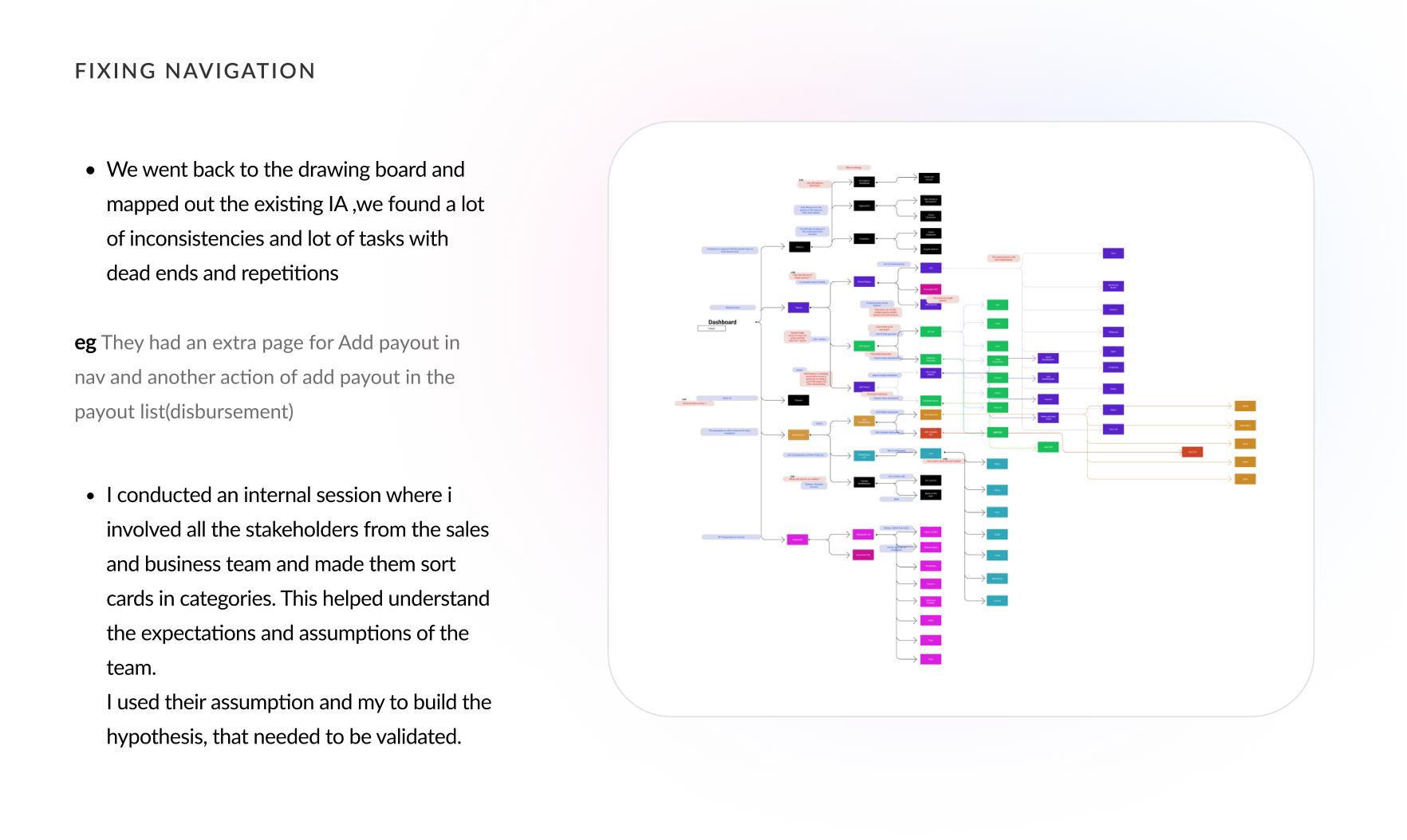
Navigation was a mess of inconsistencies, dead-ends and repetition — e.g. "Add payout" existed in both the nav and the disbursement list. I ran an internal card-sorting session with sales and business stakeholders to surface their assumptions, then turned those into hypotheses to validate.

What the card sort told us

  • 89% of developers reach checkout docs via direct search.
  • 91% liked an API-key link in the dashboard under account setup.
  • Naming caused confusion — "payout" was read as "withdrawal".
  • Receiver-list management belonged on the balance page, not its own nav item.
Re-mapping the information architecture
Back to the drawing board — mapping the existing IA and its dead-ends.
Old vs new categorised navigation
Old vs new — categorised navigation, prioritising merchant branding.
06 / Iteration

Iteration via UT

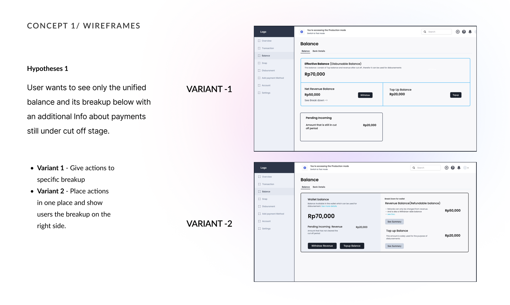
I iterated each phase against usability tests. Users wanted the balance breakup shown right next to the effective balance, and crucially wanted to know how much was still under cut-off so they could plan vendor payments.

  • Moved receiver verification inline into payout creation — cutting a whole detour.
  • Surfaced "money clearing in the next N days" as a first-class decision input.
  • Trimmed the dashboard to the two decisions users actually make here: add money or withdraw.
Overhauled settings with refined configuration
Settings overhaul — restructured into Business, Product and Development.
07 / Final

Final & handover

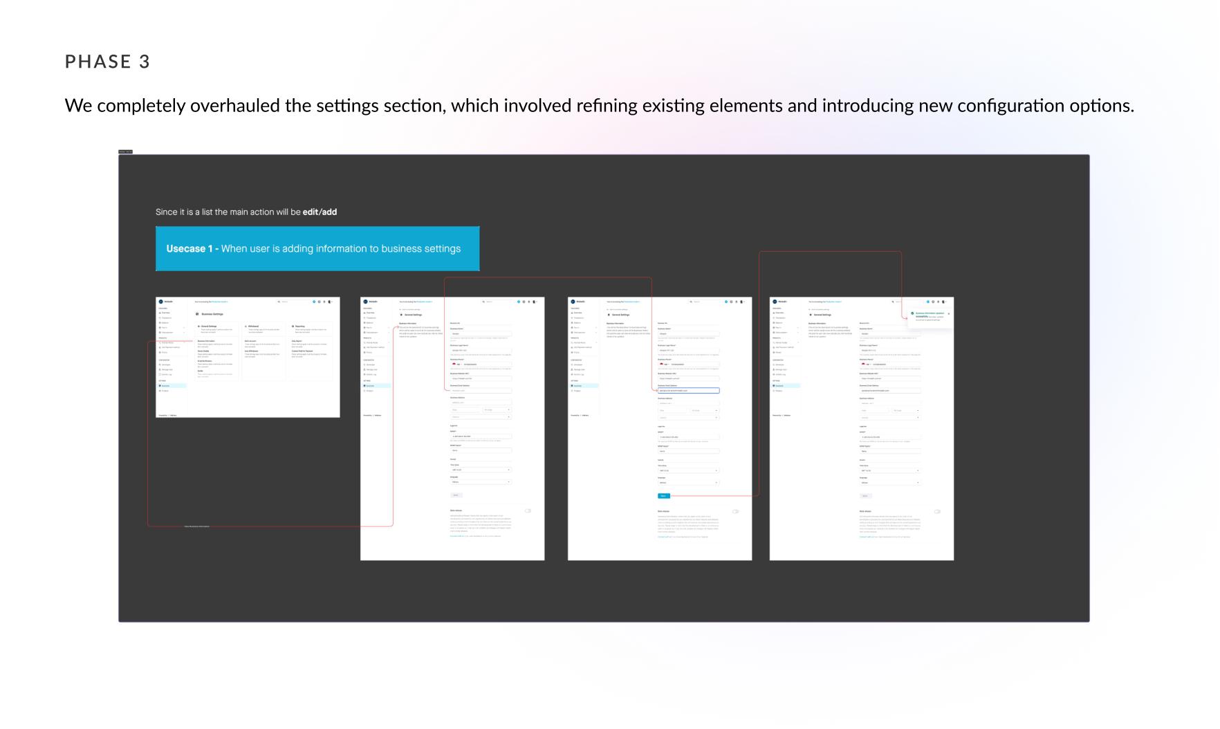
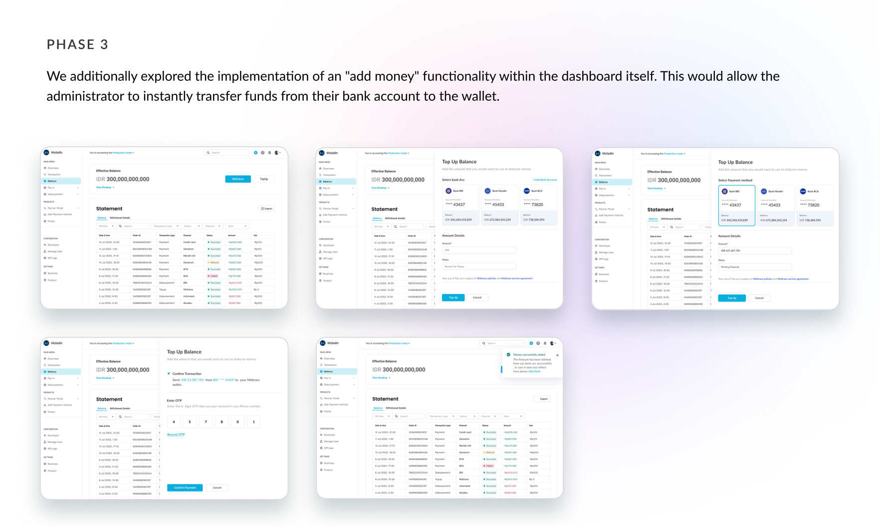
Phase 3 delivered the ideal unified wallet — surfacing the priority information that drives the add-vs-withdraw decision, plus an in-dashboard "add money" that instantly moves funds from bank to wallet.

Add money to wallet directly from the dashboard
Phase 3 — instant "add money" from bank to wallet inside the dashboard.

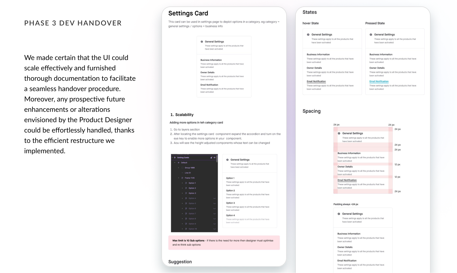
I made sure the UI could scale and shipped thorough documentation for a clean handover, so future enhancements would be effortless thanks to the restructured system.

Developer handover documentation
Scalable UI + documentation for a seamless dev handover.
Stop merchants from moving money to move money.
— The principle behind the unified wallet
08 / Impact

Impact

By unifying the wallet and the dashboard around the merchant's real decisions, we removed the single biggest reason merchants leaked volume to competitors.

$600M+
GTV driven by the unified merchant dashboard & checkout
3→0
Days to move money between revenue and vendor payments
2→1
Products merged into one coherent dashboard
Next case study
GoPay Savings →