← All work
Midtrans · Snap Payment Gateway · Checkout Popup UI Indonesia

Checkout in two steps, not six

Snap — a ground-up revamp of the SNAP checkout popup that merchants drop into their sites: fewer steps to pay, merchant branding built in, and a sleek, state-of-the-art flow.

Role
Product designer — research, improving flows, UI, collaboration
Partners
Midtrans, Product, Engineering, Research
Platform
Embeddable checkout popup — web & mobile
Focus
Conversion & transaction completion
Interactive prototype — Phase 1 plays, then Phase 2 demos the GoPay one-tap flow
At a glance

Product Snap

SNAP is the checkout popup merchants integrate to accept payments. The research team flagged that the existing flow was driving real drop-off at transaction completion — so we rebuilt it.

Details

Embeddable checkout popup · web & mobile
surface
Product Designer — research, improving flows, UI, collaboration
role
Midtrans · Product · Eng · Research
team
Conversion · transaction completion
scope

Problem Too many steps

Paying took 5–6 steps where competitors needed 2. There was little to no merchant branding, an outdated look and feel, clumsy saved-card removal and unclear promos.

Solution Frictionless

A minimal, sleek popup with merchant branding, saved cards surfaced in the card flow, clear instructions, a real success screen and quick EMI selection.

Result Trust by design

A checkout merchants are proud to embed — reinforcing reliability while moving users toward completed transactions.

6→2
Steps to Pay
Brought in line with the best in market
8
Users Tested
Concepts & wireframes validated before build
15→70%
Checkout Conversion
GoPay one-click payment, lifted across three phases
01 / Discovery

Finding the problem

The research team identified several issues on SNAP — the checkout popup merchants embed to take payments — that were potentially leading to a large drop-off in transaction completion: inefficient payment steps, unclear instructions and technical errors.

The brief was clear: create a credit-card checkout that is quick and easy with no more than the necessary steps, keep information crisp and scannable, and make the experience sleek enough that merchants proudly integrate Snap with their site.
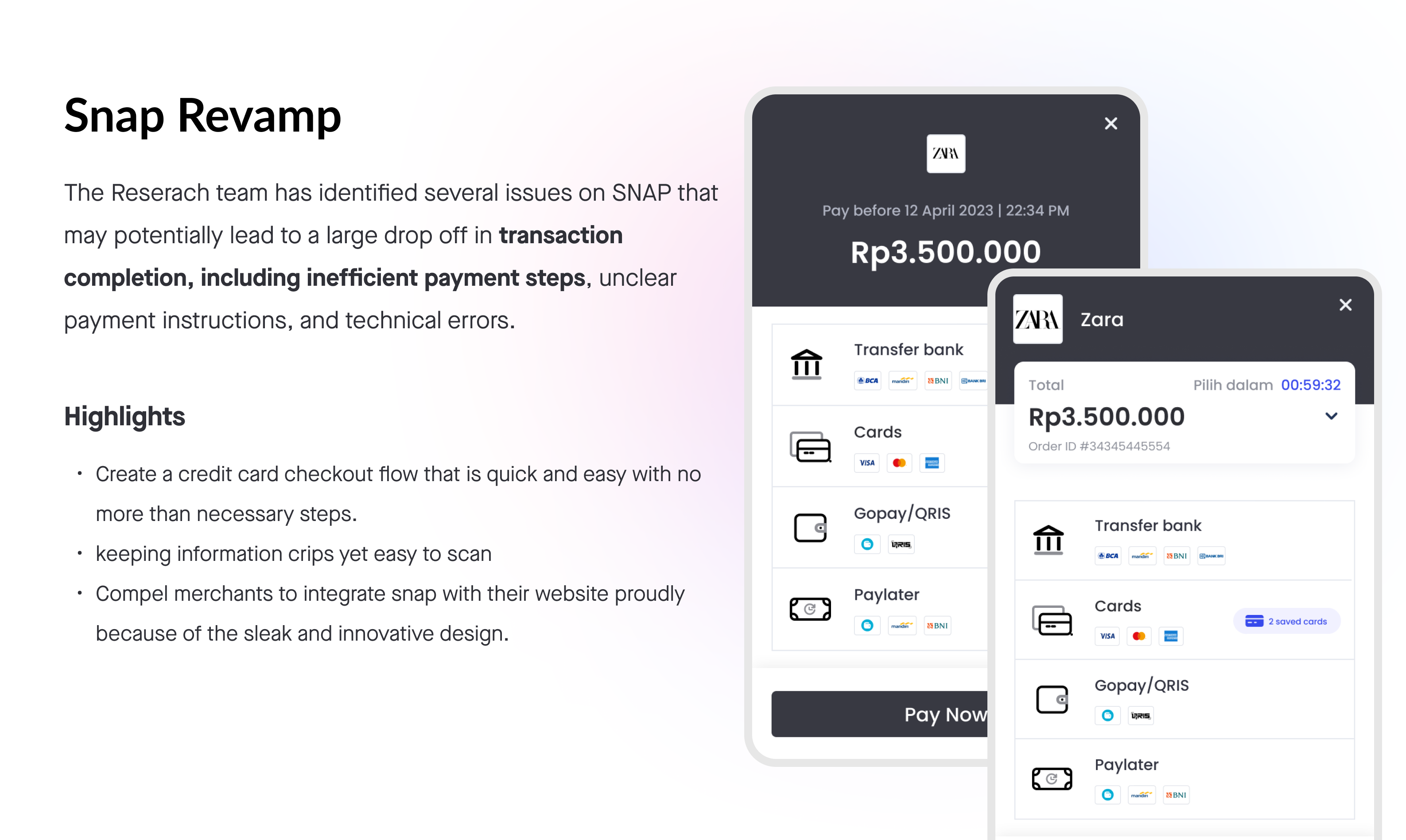
Snap Revamp — a quick, branded credit-card checkout popup
Snap Revamp — a quick, branded credit-card checkout popup.
02 / Problem

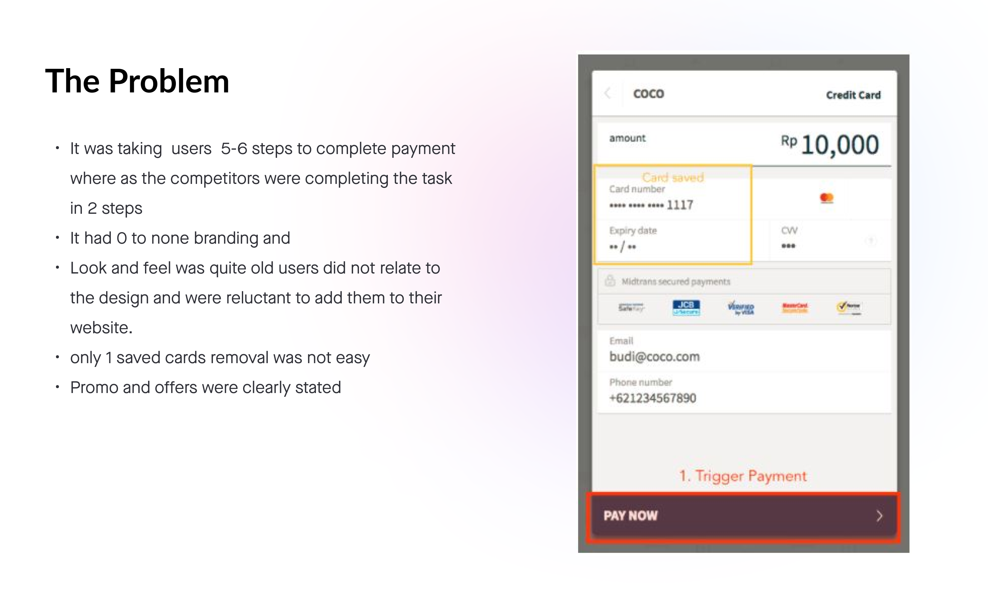
The problem statement

  • It took users 5–6 steps to complete a payment where competitors closed the task in two.
  • The popup had little to no merchant branding — users didn't relate it to the site they were buying from.
  • The look and feel was dated, making merchants reluctant to add it to their websites.
  • Removing a saved card wasn't easy, and promos and offers weren't clearly stated.
The old SNAP credit-card popup — multi-step, unbranded
The old credit-card flow — multi-step, unbranded and hard to scan.
03 / Research

Research, research, research

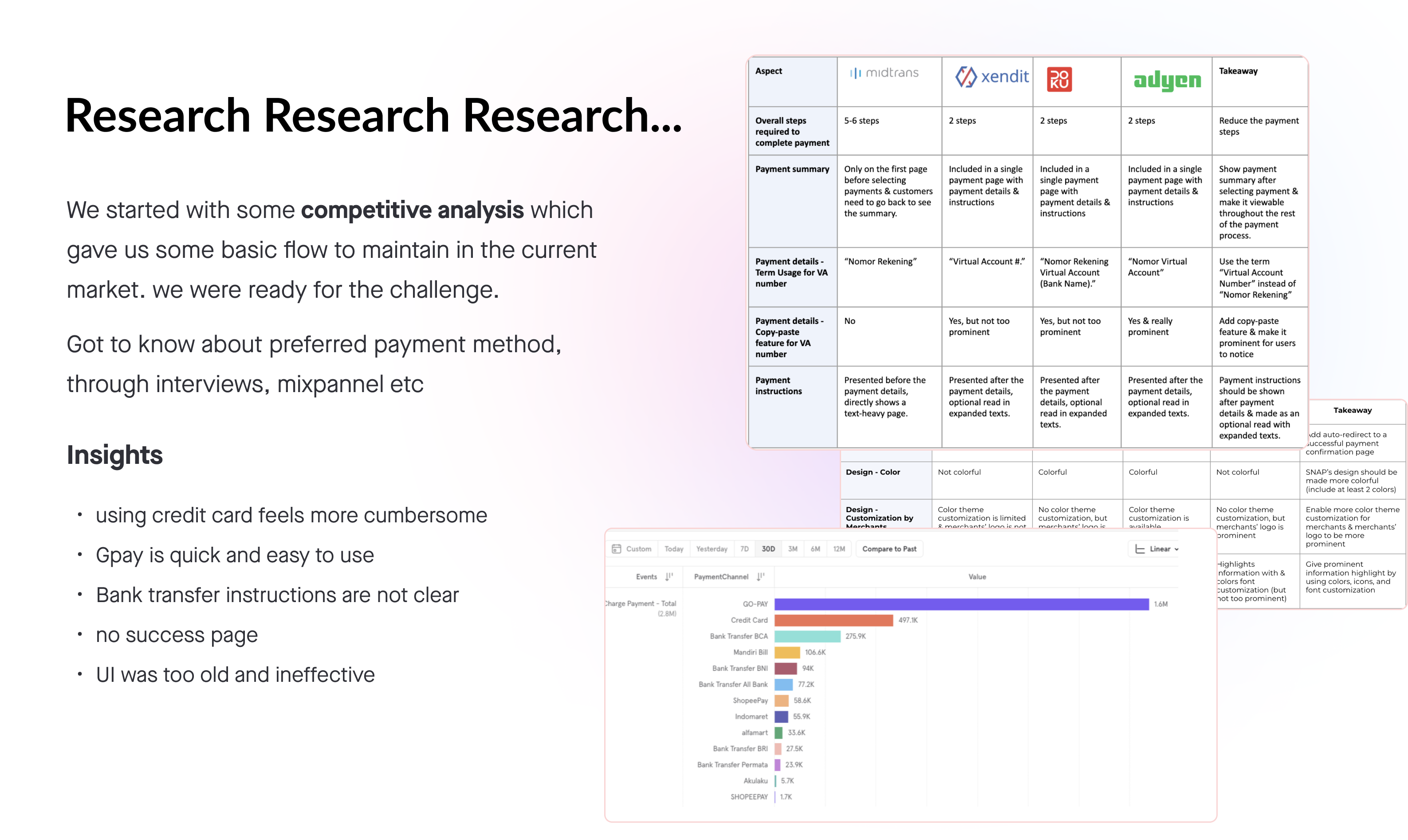
We started with competitive analysis — Midtrans, Xendit, Adyen and others — to map the baseline flow the market expected. Then we got to know users' preferred payment methods through interviews and Mixpanel data.

  • Paying by credit card felt cumbersome compared with the alternatives.
  • GoPay was quick and easy — the bar everything else was measured against.
  • Bank-transfer instructions weren't clear, leaving users stuck mid-flow.
  • There was no success page — users never got confirmation they'd paid.
  • The UI was old and ineffective.
Competitive analysis matrix and Mixpanel payment-method breakdown
Competitive analysis across providers, backed by Mixpanel payment-method data.
04 / Direction

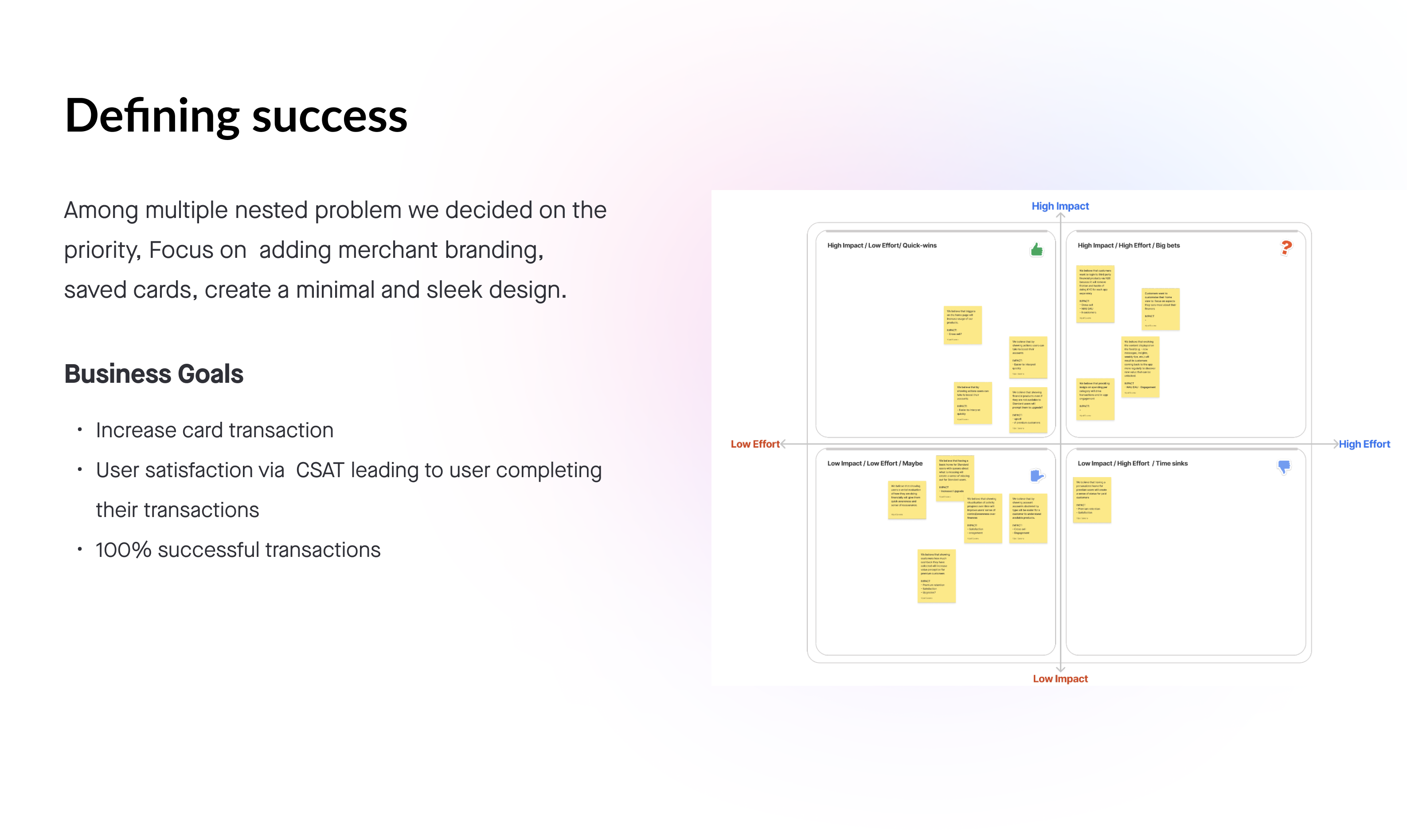
Defining success

We framed the target plainly: enable a frictionless and state-of-the-art experience, powered by product innovation, that reinforces merchant trust and reliability in our products.

Among multiple nested problems we chose a priority: focus on adding merchant branding, saved cards, and a minimal, sleek design.

Impact vs effort prioritization matrix and business goals
Business goals mapped onto an impact/effort matrix to lock the priorities.
05 / Explore

Two directions for layout

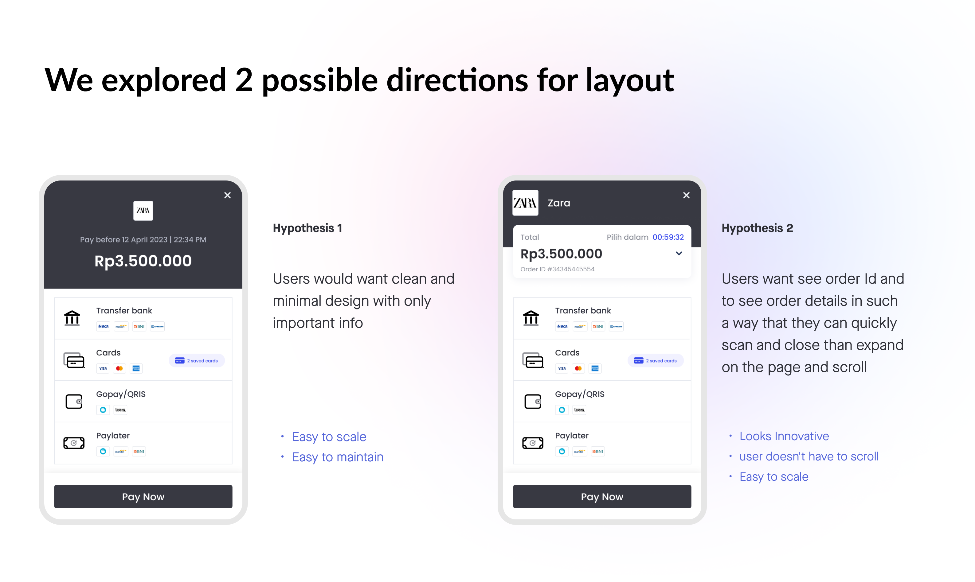
I explored two layout hypotheses and tested the trade-offs:

  • Hypothesis 1 — a clean, minimal popup showing only the important info. Easy to scale and maintain.
  • Hypothesis 2 — surface the order ID and details so users can quickly scan and close rather than expand and scroll. Looks innovative and still easy to scale.
Two checkout popup layout hypotheses side by side
Clean-and-minimal versus order-ID-forward — the two directions explored.
06 / Validate

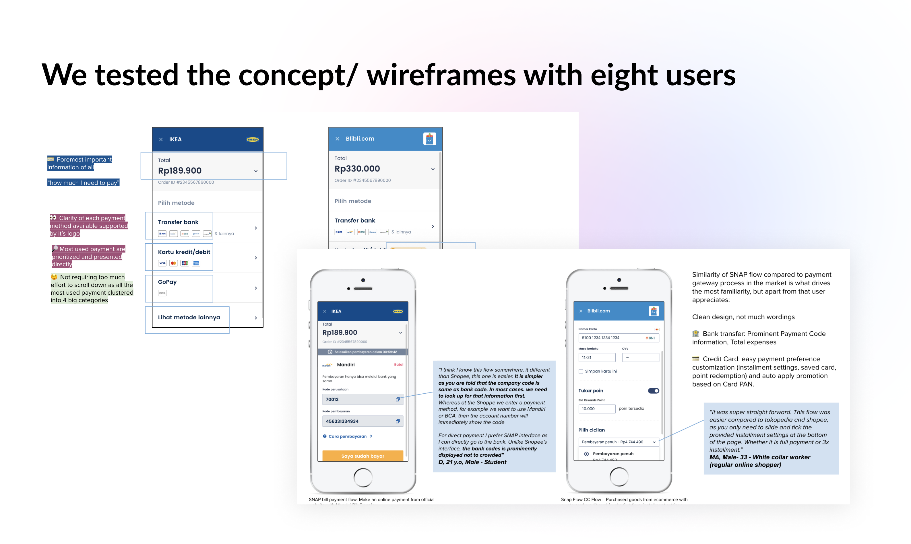
Testing with eight users

I tested the concept and wireframes with eight users, watching where they hesitated and refining the wording and hierarchy off the back of it — clean design, much clearer instructions for bank transfer and the Permanent Payment Code, and saved cards layered into the credit-card flow.

Concept and wireframe testing sessions with eight users
Wireframe testing — verbatim user feedback fed straight back into the flow.
07 / Final

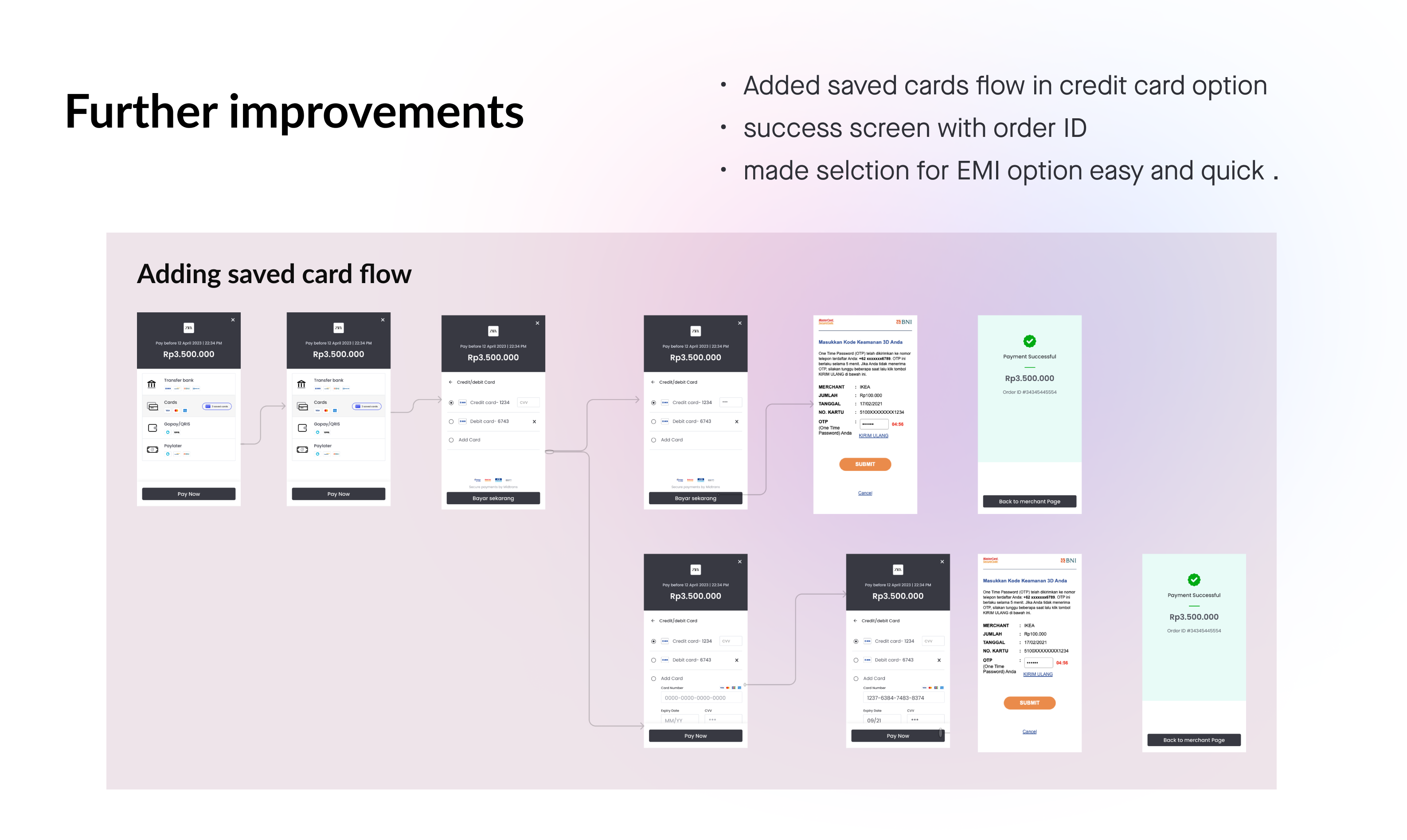
Further improvements

The final pass layered in the refinements that mattered most:

  • Added a saved-cards flow inside the credit-card option.
  • A real success screen with the order ID, so users always know the payment went through.
  • Made EMI selection easy and quick.
Final saved-card flow ending in a success screen with order ID
The saved-card flow — from card entry through to a success screen with order ID.
08 / Impact

Impact

Snap turned a multi-step, unbranded popup into a quick, branded and trustworthy checkout — closing the gap with the best in market, giving merchants something they're proud to embed, and pointing every decision at one number: completed transactions. Shaped by competitive research, Mixpanel data and validated through testing with eight users. The payoff: checkout conversion climbed from 15% to 70% across three phases.

  • 15% → 70% checkout conversion — 15% at baseline, up to 35% in phase one, and 70% by phase three.
  • GoPay one-click payment — integrated in phase two; the lever that drove conversion from 35% to 70%.
  • 6 → 2 steps to pay — brought in line with the best in market.
  • 8 users tested — concepts and wireframes validated before build.
Quick, branded, and done.
— The bar Snap was built to
Next case study
GoPay Savings App →