← All work
Moment · Lead Design System Payment Gateway Multi-brand

One system, every brand

The design system for Moment's payment gateway — three-tier tokens, a configurable brand system and a living Storybook that let one checkout wear DStv, Moment or any merchant's brand, on desktop and mobile web.

View the live Storybook ↗
Impact
2
Platforms Scaled
Desktop and mobile web built on one design system
3
Brands, One Token
DStv Blue, Moment and Blue from a single brand variable
↓
Design ↔ Dev Load
A shared Storybook replaced spec-by-spec handoffs
Role
Design Lead — system architecture, tokens, components, Storybook
Team
Product design, frontend engineering, product
Platforms
Desktop & mobile web checkout
Built with
Figma, React, shadcn/ui & semantic tokens
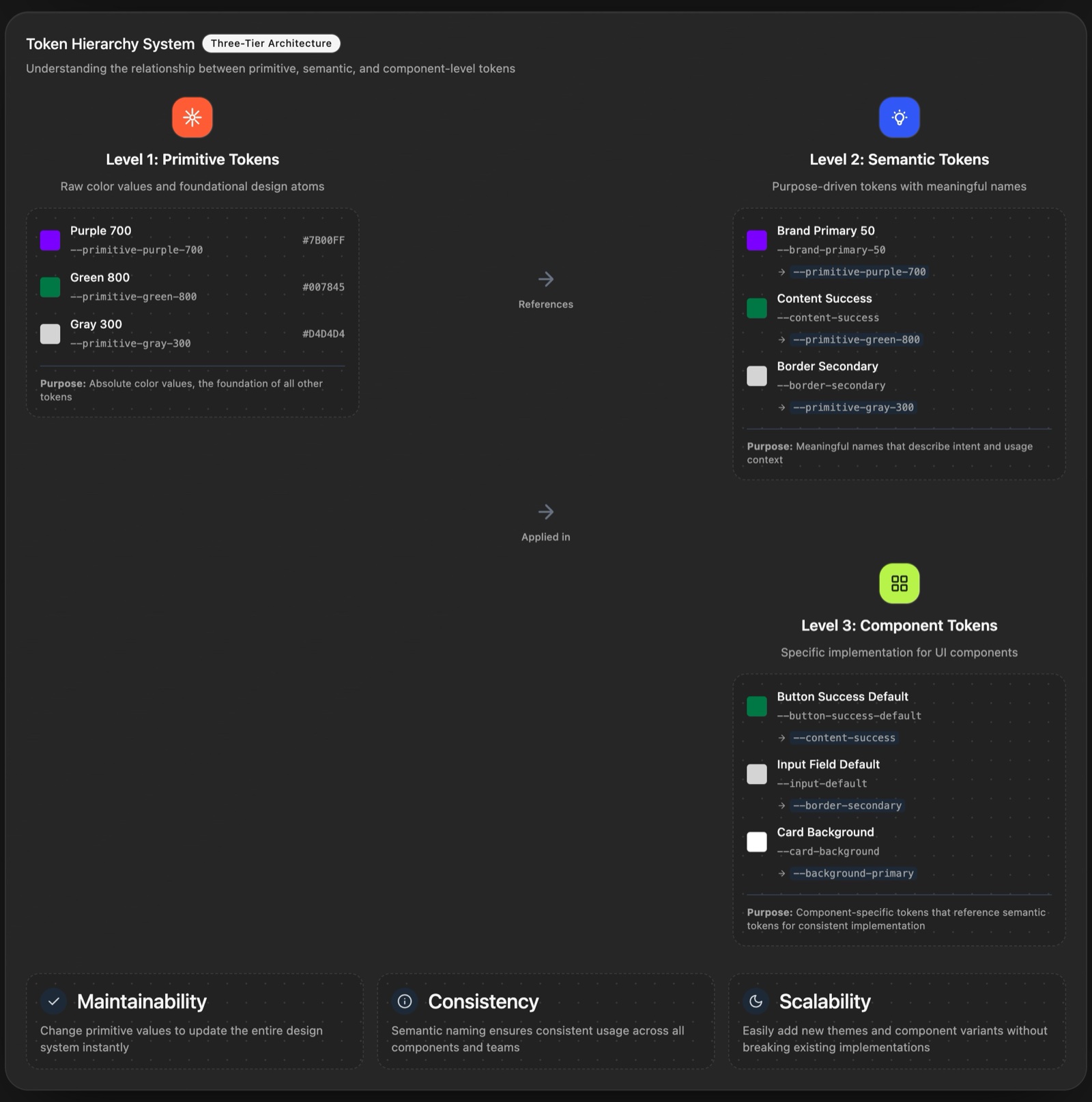
Three-tier token hierarchy — primitive, semantic and component tokens
At a glance

Product Payment gateway DS

The design system behind Moment's hosted checkout — tokens, components and brand themes, documented in a live, interactive Storybook.

Details

Figma library · Storybook · React
surface
Design Lead — architecture, tokens, components
role
Design · Frontend · Product
team
Tokens · buttons · inputs · type · guidelines
scope

Problem One gateway, many brands

The same checkout had to look like DStv, Moment or a merchant. Without a shared system, every brand meant restyling screens by hand and long design–dev back-and-forth.

Solution Tokens + Storybook

A three-tier token architecture with one configurable brand variable, a component library in every size and state, and a Storybook both teams work from.

Result Scaled across web

Desktop and mobile web shipped on one system, in light and dark, with brands switched by changing a single token.

01 / Context

One gateway, many faces

Moment's payment gateway is white-labelled. The same checkout has to feel native to DStv, to Moment itself, and to the merchants who plug it into their own products — on a laptop and on a phone.

Before the system, each brand was a one-off. Designers restyled screens, engineers rebuilt them, and every new brand or edge case started another round of "which blue, which size, which state?"

  • No shared source of truth — specs lived in screens, not in code.
  • Brand by hand — re-skinning for a merchant touched every component.
  • Inconsistent sizing and states — buttons and inputs drifted between flows.
  • Heavy handoffs — design and dev spent more time aligning than building.
02 / Architecture

Three tiers of tokens

The foundation is a three-tier token architecture. Each tier only talks to the one below it, so a change in one place flows everywhere.

  • Primitive tokens — raw values like --primitive-purple-700 or --primitive-green-800.
  • Semantic tokens — purpose-driven names like --brand-primary-50, --content-success and --border-secondary.
  • Component tokens — what components actually use: --button-success-default, --input-default, --card-background.

The rules are simple: components use component tokens, component tokens reference semantic ones, only semantic tokens touch primitives — and nothing is ever hard-coded.

Token hierarchy — primitive tokens referenced by semantic tokens, applied in component tokens
Primitive → semantic → component: maintainable, consistent, scalable.
03 / Theming

A configurable brand system

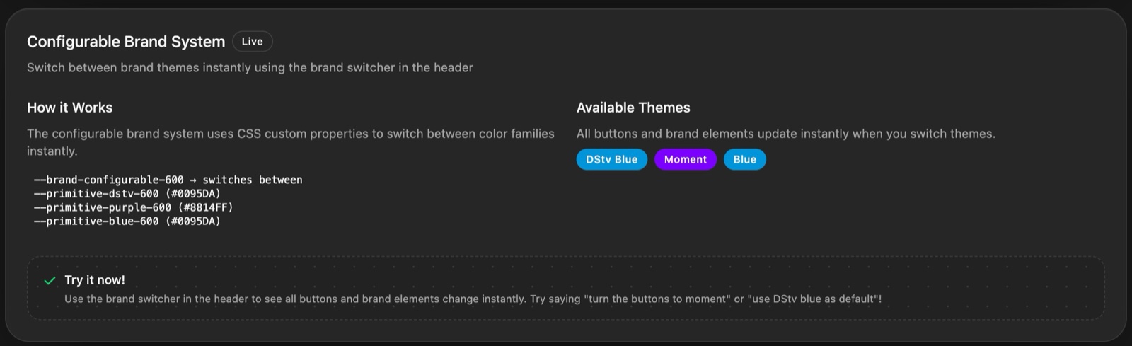
Brand colour runs through one variable, --brand-configurable-600. Point it at --primitive-dstv-600, the Moment purple or the secondary blue, and every button and brand element in the gateway updates instantly — no component changes, no rebuild.
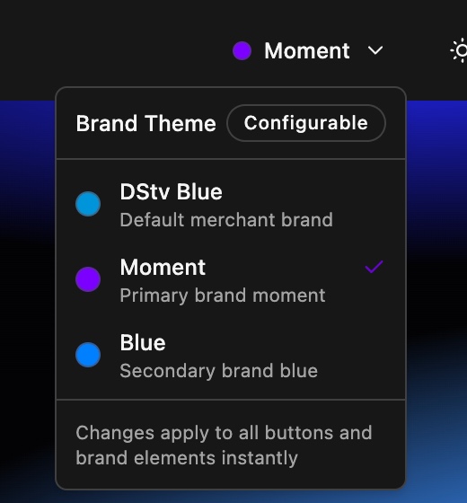
Storybook brand switcher with DStv Blue, Moment and Blue themes
The Storybook's brand switcher — DStv Blue, Moment and Blue.
Configurable brand system — one CSS variable switching between primitive colour families
One brand variable, three primitive families.

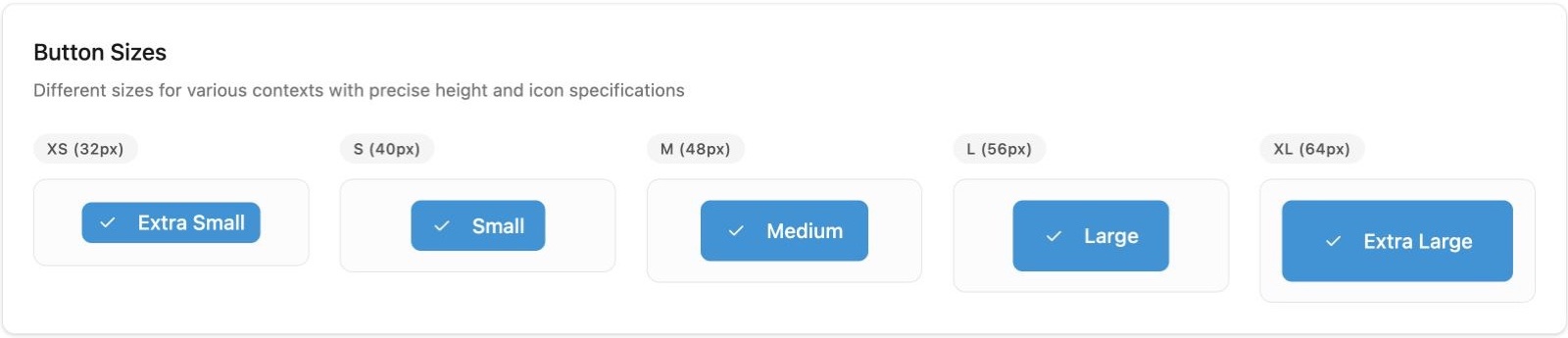
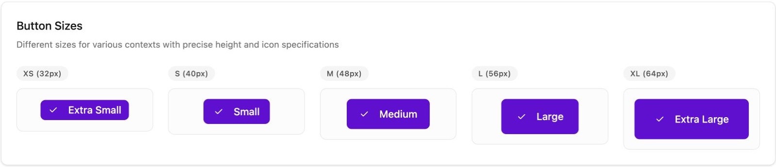
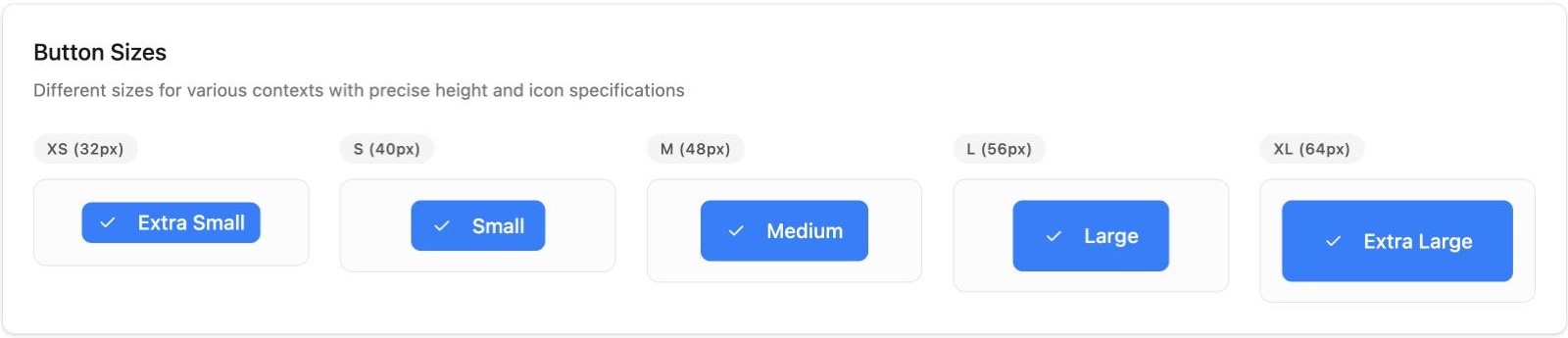
Same components, three brands

Button sizes in the DStv Blue theme
DStv Blue — the default merchant brand.
Button sizes in the Moment theme
Moment — the primary brand.
Button sizes in the Blue theme
Blue — the secondary brand.

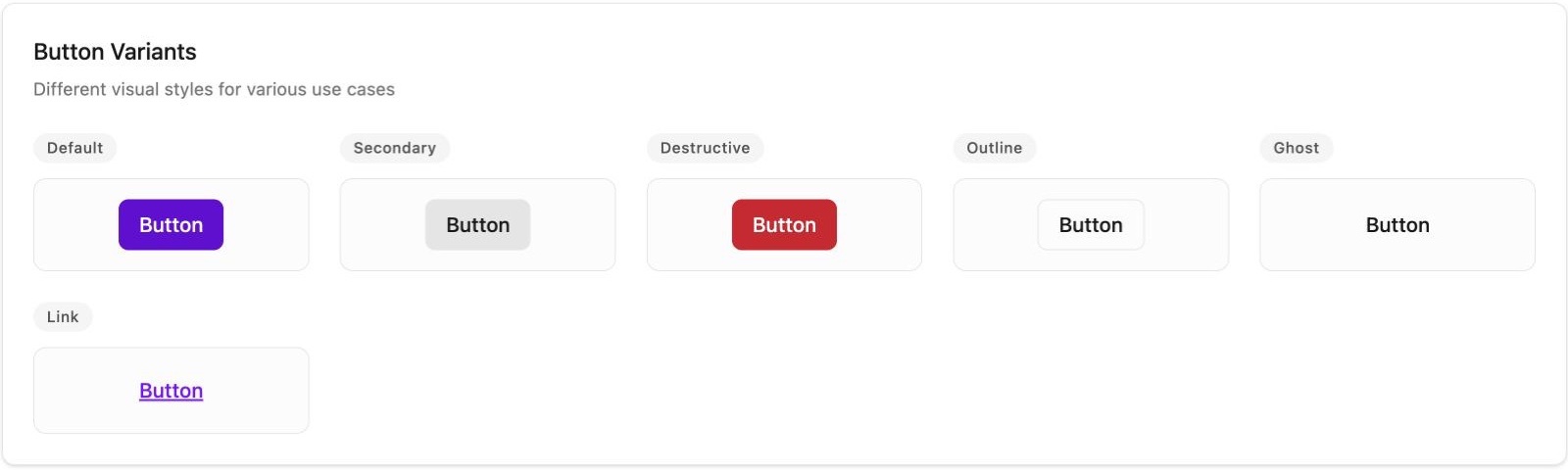
Every token is also mapped for light and dark mode, so the same components read correctly whichever way a merchant's page is set.
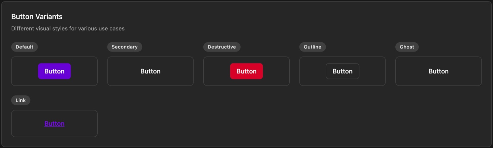
Button variants in dark mode, Moment theme
Dark mode.
Button variants in light mode, Moment theme
Light mode.
04 / Components

Buttons

Buttons carry checkout's most important moments — pay, continue, retry — so they got the most complete treatment:
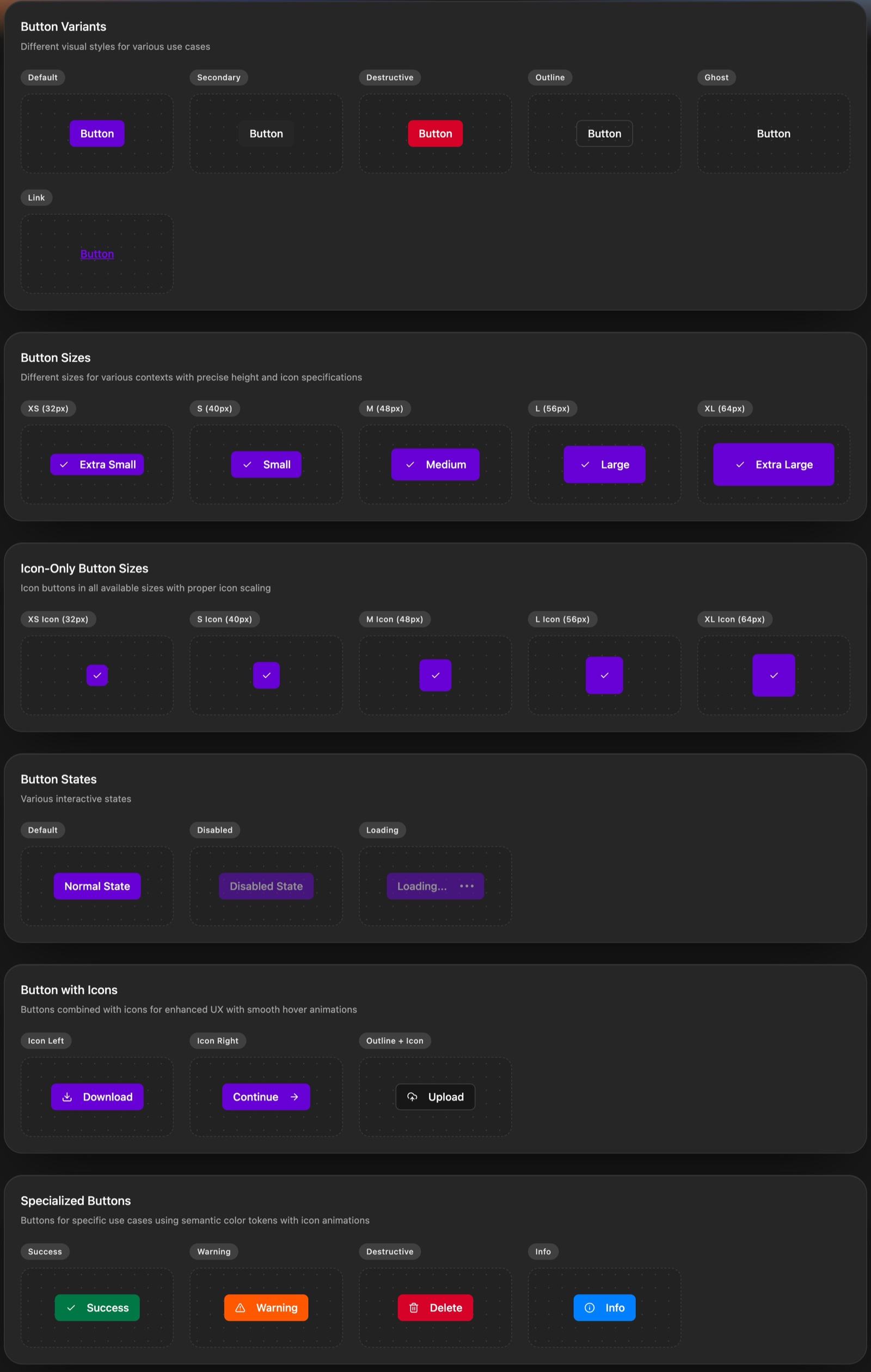
  • Six variants — default, secondary, destructive, outline, ghost and link.
  • Five sizes on a shared scale — XS 32px, S 40px, M 48px, L 56px, XL 64px — plus matching icon-only buttons.
  • States — default, disabled and loading, so a payment in progress is never ambiguous.
  • Specialised buttons — success, warning, destructive and info, driven by semantic colour tokens.
Full button component set — variants, sizes, icon-only sizes, states, icons and specialised buttons
The full button set, shown in the Moment theme.
05 / Components

Inputs built for payments

Card details, phone numbers and amounts are where checkout succeeds or fails. Input fields use the same XS–XL sizing as buttons, so forms line up without exceptions, and a clear token hierarchy for feedback:

  • Default → border-secondary, hover → border-tertiary, focus → border-focus with a ring, active → border-quaternary.
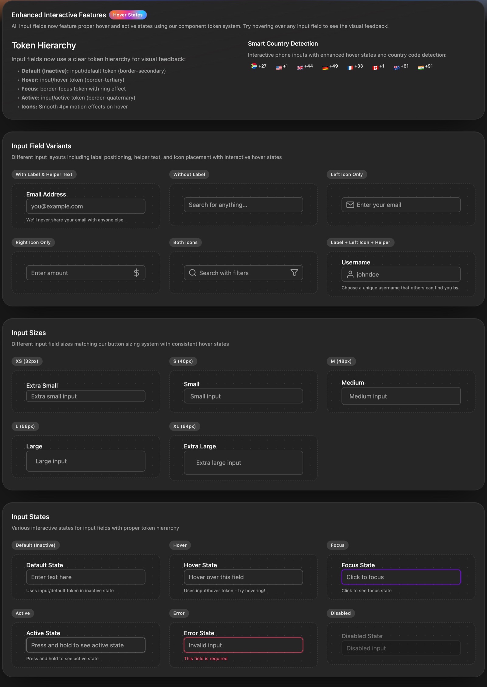
  • Error and disabled states with inline validation messages.
  • Smart country detection for phone fields — +27 South Africa first, alongside other codes.
  • Variants with labels, helper text, left and right icons, plus dropdown selects.
Input field components — token hierarchy, variants, sizes and states
Input fields — variants, sizes and states on one token hierarchy.
06 / Typography

Semantic type

Type works like colour: named by role, not by size. Pre-defined styles combine font size, weight, line height and letter spacing into one class.

  • Display (96 / 72 / 60px) for hero moments.
  • Headings for page structure.
  • Body XS–XXXL for readable content.
  • Labels XXXS–XL for interactive elements and forms.
  • Numbers for amounts and metrics — essential in a payment flow.

Each style ships as a copyable class such as typography-heading-1, so engineers never have to translate a spec.
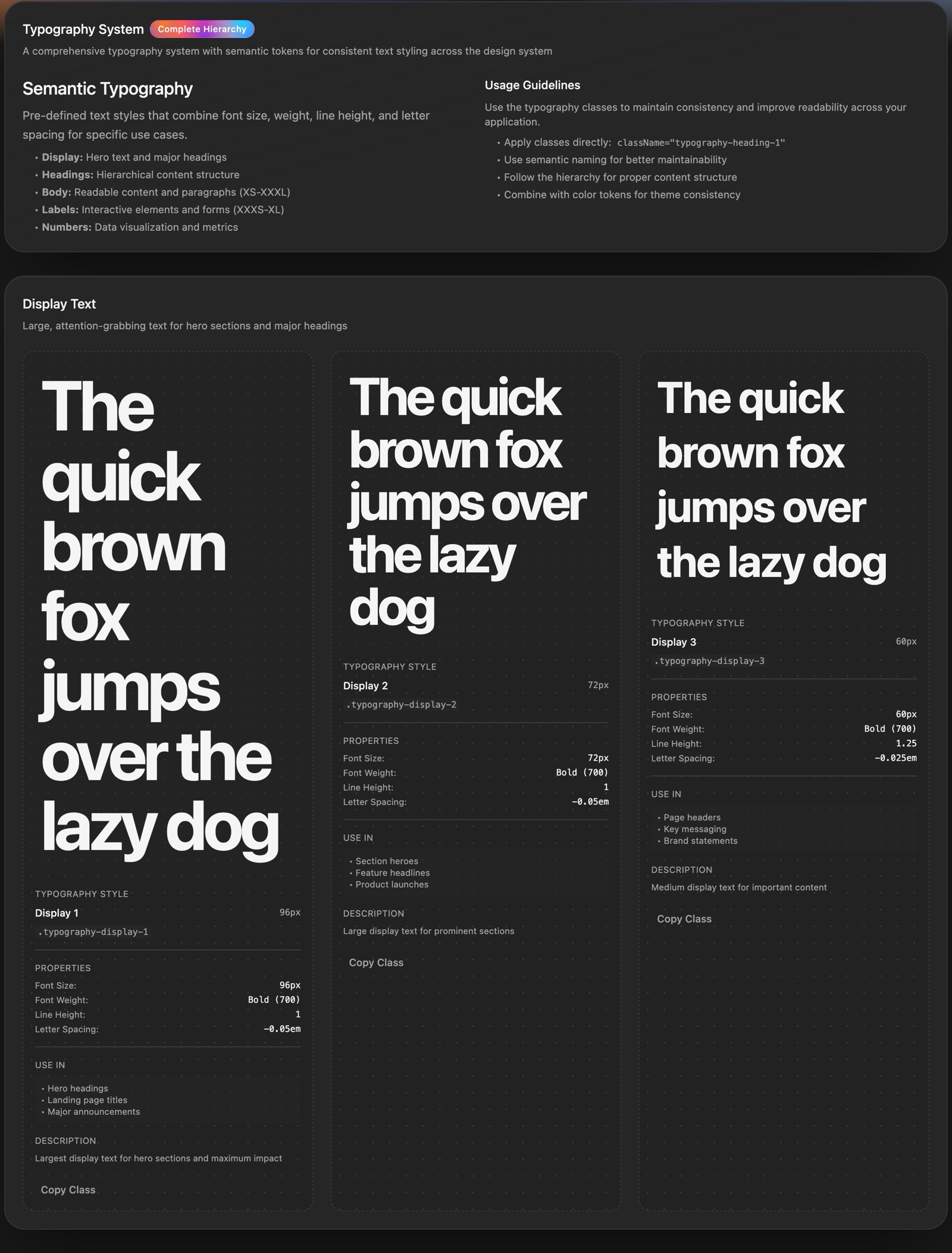
Typography system — display and heading styles with their properties and classes
Semantic typography with properties, usage and copyable classes.
07 / Guidelines

Principles & accessibility

Four principles guide every decision: consistency, accessibility, flexibility and performance. All components target WCAG 2.1 AA — 4.5:1 contrast for text, 3:1 for large text, visible focus states and full keyboard navigation.

Usage rules sit right next to the components: one primary button per screen, destructive buttons only for irreversible actions, clear labels and the right input types on every field.
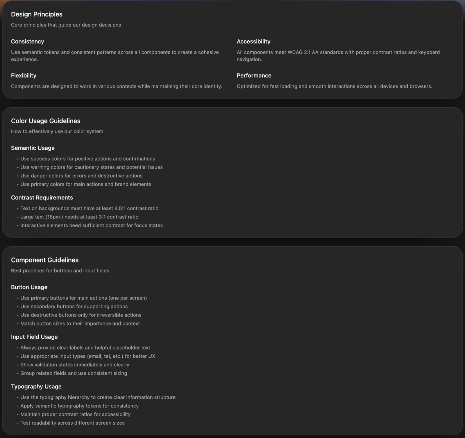
Design guidelines — principles, colour usage and component guidelines
Principles, colour usage and component guidelines.
08 / Handoff

A living Storybook

Instead of static specs, the system lives in an interactive Storybook that design and engineering share. Switch brand or mode and see every component update; copy a class or a token straight into code.

  • Design assets — the Figma component library and an SVG icon pack.
  • Code — React component templates and an installable package.
  • One vocabulary — the same token and class names in Figma, the Storybook and code.

When a question comes up, the answer is a link, not a meeting.
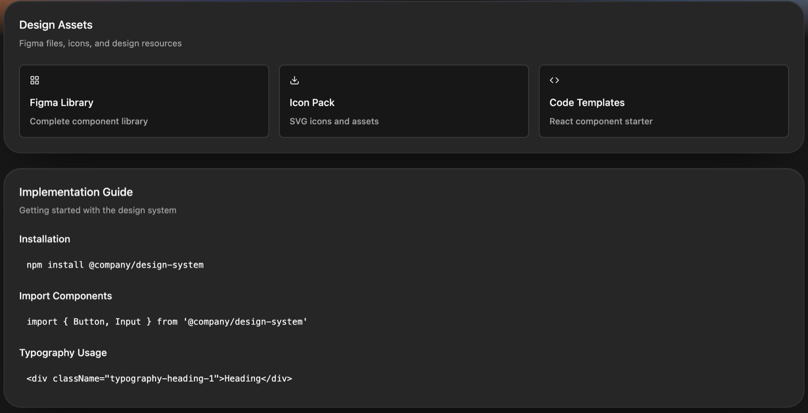
Resources — Figma library, icon pack, code templates and implementation guide
Resources and the implementation guide.

Open the Storybook ↗

09 / Impact

Impact

The design system turned Moment's payment gateway from a set of hand-styled screens into a product that scales. Desktop and mobile web now build from the same foundation, and new brands arrive as configuration rather than redesign.

  • Scaled desktop and mobile web — both platforms built on the one design system.
  • Reduced design ↔ dev communication load — a shared Storybook and token names replaced spec-by-spec handoffs and clarification threads.
  • Rebrand with one token — DStv Blue, Moment and Blue from a single configurable brand variable.
  • Consistent sizing — buttons and inputs share one XS–XL scale across every flow.
  • Light and dark — every token mapped for both modes.
  • Accessible by default — WCAG 2.1 AA contrast, focus states and keyboard support.
  • Faster builds — engineers compose from ready components instead of rebuilding them per brand.
Change one token, rebrand the gateway.
— The principle behind the system
Next case study
Unified Wallet →